

Some of my absolute favorite blog designs use what I like to call a "text header". With these header images, the focus is on typography and minimalism. With most of these images, a lot of time and graphic design skill goes into them. A designer will compare different fonts and how they work together. Sometimes, a program like Illustrator will be used to make the fonts "wrap around" each other. The whole process can be a little overwhelming.
But, sometimes, simple just works. Sometimes easy does it. Sometimes over thinking a design isn't the answer. Since the title of this series is "Blog Design Basics", we're going to stick with a "basic" text header. We're not going to delve headfirst into illustrator.
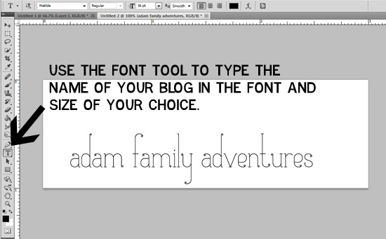
This is the header that we will be making today:

Ready? Let's go.
On the header that I posted above, you can see that I used a little "doodle" font for my butterfly. Dingbat fonts can be a great way to add a little special "something" to your design. There's lots of places to download free "doodle" fonts online. Some of my favorite doodle fonts are:
- Itty Bitty Baby (good for a new mommy blog!)
- Sweet Nature Dings
- Jelene's Doodles
- ND Urban II (silhouettes)
- Janda Spring Doodles (what I used for this header)
You can use any doodle font you want. Check out MTF fonts, dafont.com (check the "kids" and "various" under dingbats), and Fonts for Peas for more doodle fonts.
Like with the background tutorial, I'm going to explain how to create this image in both Photoshop and GIMP. But, we'll start with Photoshop.
First, you're going to want to create a new image. We're going to make a 900x300 header (these are the settings I will use when we set up the blog in a few sessions!). Obviously, you're the designer, so you can use whatever width you want. But, I've found that much bigger is too big and much smaller is too small. I think that "900" is a sweet spot. :)

After we've created a new image, you're going to use the font tool to type in the name of your blog in the font of your choice. If you don't know which font to pick, look back on the "Fonts" lesson. Adjust the font size as needed. Make sure that it's not too small and that you can read it. Since this header is font based, the font and size really matters. Choose carefully (and not Comic Sans!). :)
Now, you're going to use a "doodle" font to add an illustration.

Now, you are going to select the layer of your illustration (in my case, "d") using ctrl+t. Hover your mouse around the corners of the square until a "half circle" arrow thing appears. Use this to rotate your image. Click the check mark when you are happy with how it looks.

Most of the time, you header won't fill up the entire image. Rather than having a bunch of white space on top, we're going to crop the image down. Use the rectangle selection tool to select the part of the image that you want to include. Leave a little space on the top and bottom, but don't mess with the width! After you've made your selection, go to Image -> Crop to crop your image and you are done!

Save this image as "Header" and set it aside until we put all of our elements together to create your blog design!
Now, for the GIMP tutorial. It's basically the same thing as Photoshop, with different buttons. In case you're new to the GIMP world, I've included some basic instructions (just like I did with Photoshop). Use the same settings for creating your image in GIMP that we did in the Photoshop tutorial (900x300, 300ppi resolution).


No comments:
Post a Comment