

Thursday, January 31, 2013
Tuesday, January 22, 2013
Real
For a long time he lived in the toy cupboard or on the nursery floor, and no one thought very much about him. He was naturally shy, and being only made of velveteen, some of the more expensive toys quite snubbed him. The mechanical toys were very superior, and looked down upon every one else; they were full of modern ideas, and pretended they were real. The model boat, who had lived through two seasons and lost most of his paint, caught the tone from them and never missed an opportunity of referring to his rigging in technical terms. The Rabbit could not claim to be a model of anything, for he didn't know that real rabbits existed; he thought they were all stuffed with sawdust like himself, and he understood that sawdust was quite out-of-date and should never be mentioned in modern circles. Even Timothy, the jointed wooden lion, who was made by the disabled soldiers, and should have had broader views, put on airs and pretended he was connected with Government. Between them all the poor little Rabbit was made to feel himself very insignificant and commonplace, and the only person who was kind to him at all was the Skin Horse.
The Skin Horse had lived longer in the nursery than any of the others. He was so old that his brown coat was bald in patches and showed the seams underneath, and most of the hairs in his tail had been pulled out to string bead necklaces. He was wise, for he had seen a long succession of mechanical toys arrive to boast and swagger, and by-and-by break their mainsprings and pass away, and he knew that they were only toys, and would never turn into anything else. For nursery magic is very strange and wonderful, and only those playthings that are old and wise and experienced like the Skin Horse understand all about it.
"What is REAL?" asked the Rabbit one day, when they were lying side by side near the nursery fender, before Nana came to tidy the room. "Does it mean having things that buzz inside you and a stick-out handle?"
"Real isn't how you are made," said the Skin Horse. "It's a thing that happens to you. When a child loves you for a long, long time, not just to play with, but REALLY loves you, then you become Real."
"Does it hurt?" asked the Rabbit.
"Sometimes," said the Skin Horse, for he was always truthful. "When you are Real you don't mind being hurt."
"Does it happen all at once, like being wound up," he asked, "or bit by bit?"
"It doesn't happen all at once," said the Skin Horse. "You become. It takes a long time. That's why it doesn't happen often to people who break easily, or have sharp edges, or who have to be carefully kept. Generally, by the time you are Real, most of your hair has been loved off, and your eyes drop out and you get loose in the joints and very shabby. But these things don't matter at all, because once you are Real you can't be ugly, except to people who don't understand."
"The Velveteen Rabbit" by Margery Williams
-
Monday, January 21, 2013
Blog Design Basics: Photo Header

Today we're going to learn how to make a photo header.
When we're done, we'll have something like this (except yours will have your pictures!):

First, we need to create a new image. Since this header has photos on it, we're going to make it a little taller than the text header. Create a 900x500 image with a 300ppi resolution.

Now, we need to resize our pictures. Go to image -> image size to resize your pictures. In the dialogue box that pops up, set the height for 300 pixels.

Then, use the rectangle selection tool to select the photo. Copy it using the shortcut Ctrl+C.

And then paste it onto the header image that we created earlier using the shortcut Ctrl+V. Repeat these steps for all of your pictures (preferably 2 vertical and 1 horizontal, that's what fits best!).

Once you've pasted all of your images, space them out so that the white space in between them is even.

Now, we're going to use the rectangle tool to make a square that is the width of your first picture. Hold down the "shift" key while forming your shape to make it a square. Then, drag the square up just a little bit so that there is a small white space in between the square and the picture (yes, I know that it's no longer a square, but you get the idea).

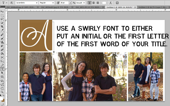
Use a swirly, cursive font to do one of two things in the square. Either:
A. Put your initial in the square
B. Put the first letter of the first word of your blog title in the square.
You pick. :)

Save this image as "Header" and set it to the side until we put our design together!
We've got one more kind of header to learn! Come back next week to learn how to create a "scrapbook style" header! :)
Monday, January 14, 2013
Blog Design Basics: Text Headers
Some of my absolute favorite blog designs use what I like to call a "text header". With these header images, the focus is on typography and minimalism. With most of these images, a lot of time and graphic design skill goes into them. A designer will compare different fonts and how they work together. Sometimes, a program like Illustrator will be used to make the fonts "wrap around" each other. The whole process can be a little overwhelming.
But, sometimes, simple just works. Sometimes easy does it. Sometimes over thinking a design isn't the answer. Since the title of this series is "Blog Design Basics", we're going to stick with a "basic" text header. We're not going to delve headfirst into illustrator.
This is the header that we will be making today:

Ready? Let's go.
On the header that I posted above, you can see that I used a little "doodle" font for my butterfly. Dingbat fonts can be a great way to add a little special "something" to your design. There's lots of places to download free "doodle" fonts online. Some of my favorite doodle fonts are:
- Itty Bitty Baby (good for a new mommy blog!)
- Sweet Nature Dings
- Jelene's Doodles
- ND Urban II (silhouettes)
- Janda Spring Doodles (what I used for this header)
You can use any doodle font you want. Check out MTF fonts, dafont.com (check the "kids" and "various" under dingbats), and Fonts for Peas for more doodle fonts.
Like with the background tutorial, I'm going to explain how to create this image in both Photoshop and GIMP. But, we'll start with Photoshop.
First, you're going to want to create a new image. We're going to make a 900x300 header (these are the settings I will use when we set up the blog in a few sessions!). Obviously, you're the designer, so you can use whatever width you want. But, I've found that much bigger is too big and much smaller is too small. I think that "900" is a sweet spot. :)

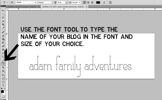
After we've created a new image, you're going to use the font tool to type in the name of your blog in the font of your choice. If you don't know which font to pick, look back on the "Fonts" lesson. Adjust the font size as needed. Make sure that it's not too small and that you can read it. Since this header is font based, the font and size really matters. Choose carefully (and not Comic Sans!). :)
Now, you're going to use a "doodle" font to add an illustration.

Now, you are going to select the layer of your illustration (in my case, "d") using ctrl+t. Hover your mouse around the corners of the square until a "half circle" arrow thing appears. Use this to rotate your image. Click the check mark when you are happy with how it looks.

Most of the time, you header won't fill up the entire image. Rather than having a bunch of white space on top, we're going to crop the image down. Use the rectangle selection tool to select the part of the image that you want to include. Leave a little space on the top and bottom, but don't mess with the width! After you've made your selection, go to Image -> Crop to crop your image and you are done!

Save this image as "Header" and set it aside until we put all of our elements together to create your blog design!
Now, for the GIMP tutorial. It's basically the same thing as Photoshop, with different buttons. In case you're new to the GIMP world, I've included some basic instructions (just like I did with Photoshop). Use the same settings for creating your image in GIMP that we did in the Photoshop tutorial (900x300, 300ppi resolution).


Wednesday, January 9, 2013
Blog Design Basics: Background (Gimp)
For those of you that don't own Photoshop, GIMP is a great free alternative. It normally works about the same as Photoshop, with just a few minor adjustments (and some things with different names). I normally prefer to work in Photoshop, but it is actually easier to make backgrounds using GIMP.
First, we are going to create a new image. Go to "File" -> "New" and this dialogue box will appear. For our background, we don't need too large of an image (since we are going to make it a seamless, repeating background). Let's make this image 200x200 with a 300 ppi resolution.

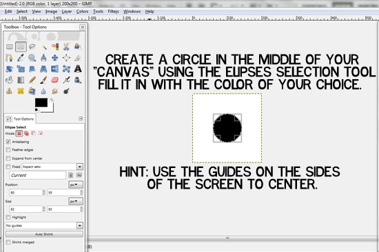
Once we have our image, we are going to create a circle in the middle. Use the ellipses selection tool while holding down the "shift" button on your keyboard to make a perfect circle. Make sure that your foreground color is the color that you want your dot to be, and then navigate to the "Select" drop down menu. At this point, select the "fill with Foreground color" option and your dot should turn that color. Then, using the move tool and the guides on the sides of the screen, center your circle.
Once things are all centered, right click on the layer in the "layer properties" menu and select "Flatten Image". This is important, otherwise the next step will not work.

Once your image is flattened, go to filters -> map -> and then select "make seamless".

The process might take a moment to load, but the image should turn out looking something like this:

Your background file is now complete! Save this file as "background". We will upload this file to blogger in a few classes when we put all of our elements together to make our blog design!
Just in case you were wondering, your image will look something like this as a background (depending on the colors you choose).

Whew! We've got our background! Tune in Monday for the next class- we'll be working on our blog header!
Monday, January 7, 2013
Blog Design Basics: Background (Photoshop)
Today we are going to work on creating a seamless background image to use as the background for our blog design in Photoshop. On Wednesday, I will be posting a tutorial on how to create a seamless background image in GIMP (for those of you that do not own Photoshop), along with some other places to find and create background images! But, for today- we are in Photoshop!
The first thing we are going to do is create a new image. Go to File -> New. For our background, we are going to create a 200x200 image. Make sure to set the resolution at 300ppi. Your settings should look as follows:

Now we are going to create some guides! It can be difficult to eyeball the center of the image, but luckily Photoshop has a nifty little tool for us to use. Under the "View" tab, click on "New Guide". We are going to create two guides: one horizontal and one vertical. These have to be done separately, but they are done the same way. Select "Horizontal" or "Vertical" and then set the position at 50%.

Once the guides are both in place, it should look like a cross over the screen. At this point, you should fill the background with the color of your choice using the bucket tool.

Use the custom shape tool to create a circle. Hold down the "shift" button on your keyboard to create a perfect circle. Once you have made the shape, press "CTRL + T" to select the circle. Use the arrow keys to place the circle in the middle of the image using the guide lines. The cross that indicates the middle of the circle should be placed where the two lines cross.

Once the shape is centered, right click on the "Shape 1" layer and select "Duplicate Layer".

Select the duplicate layer, and then go to filter -> other -> offset.

In the dialogue box, match these settings. Make sure that the "wrap around" option is selected. For this part, the number that you offset by will always be half the size of your image. Since we have a 200x200 image, we will offset by 100. But, if we had a 500x500 image, we would offset by 250. Understand?

Our background image is now complete! Save this image as "Background" and set it to the side. In a few classes, we will upload this image to blogger when we put our design together! :)
Remember, if you don't have Photoshop- no worries! Tune in tomorrow for a tutorial using GIMP to create the same seamless background (for free!).
Thursday, January 3, 2013
Blog Design Basics: Fonts
Today, we're going to talk about fonts. As a self-proclaimed font snob, this is probably the most important post of this series to me. From the time I was little, my Dad taught me about the value of fonts and graphics looking professional and readable. While it was fun to make powerpoints with a gazillion transitions and things flying in, it wasn't the most professional. Lime green writing on a pink background just isn't that readable or professional. While I've had some professors call my powerpoints "boring", at least with my custom backgrounds and readable slides, they could not deny that it was "professional".
As bloggers, it's important that we come across as professional and authoritative. Even if you're just a Mommy blogger, you don't want people to think that you're stupid (and I'm sorry, but that's what I think about blogs with lime green writing on hot pink backgrounds). You might not be explaining the theory of relativity or the historical critical method of reading the Gospels, but you still want to be taken seriously. If you're looking for blog sponsors and advertisers, this is a big deal. There can be money involved in blogging (if you're into that kind of thing), but you have to be a professional (or have some kind of scandalous history with the President- but let's not try that one).
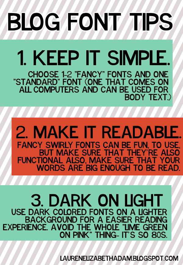
Please, please, please, don't go overboard on fonts. There's just not a reason why you need to use ten different fonts in your design. It just looks tacky. Don't do it. Stick to one or two "fancy" fonts that you might use in your header image, post titles, and sidebar titles and graphics. Then, choose one "standard" font. This should be a font that comes on all computers: Times New Romans, Century Gothic, Arial, Helvetica, Impact, Georgia...one of those kinds of fonts. Use this for the body of your posts. Nothing annoys me more than people that use "fancy" fonts for the body of their posts...it just isn't readable!
So, maybe you're thinking that these three tips sound like good ideas, but you don't really know what constitutes a "good font" vs. a "bad font". Here's just a few examples of both.

Basically, you want to make sure that your fonts are readable. You should aim for your practically blind 87 year old great-great granny to be able to read the font (okay, maybe that's overboard, but you get the idea). If you have more than one "fancy" font, make sure that they go together. Stylistically, they need to be similar. Plus, they also need to go with your theme (what we talked about last time).
By the way, I'm totally serious about the Comic Sans thing (by the way, it would probably be a wise idea to also avoid Papyrus while you're at it, because it's starting to go the way of Comic Sans). It's just not respected in the graphic design world. If you're going for "professional", don't go Comic Sans.
 |
| via |
Whew. Fonts. That was exhausting. Go ahead and pick out the fonts that you are considering for your layout (you can pick a few extras just in case the ones you love don't work out). If you need some ideas to get you started, you can visit my favorite fonts posts (1, 2) or visit the following websites:
Write down the names (and go ahead and download them if you don't already have them!) and we'll pick back up on the series on Monday! Get excited, because we're going to be working on creating a seamless background pattern! :)
Wednesday, January 2, 2013
Blog Design Basics: Intro
It's the first day of Blog Design Basics, are you ready? :)
The first thing that we need to decide is a theme.It's rather hard to come up with a design without a theme. So, we should begin by asking some questions:
- What are some of the things that you blog (or want to blog) about?
- What kinds of things define you as a person?
Now, let’s use the answers to those questions to fit ourselves into a “Blogger Category.” I know, it sounds so stereotypical. But, what kind of blogger are you?
- Cutesy
- College/20 something
- Mommy
- Married/Wedding
- Photography
- Crafty
- Writing
The kind of blogger that you are will likely influence the kind of design that you are desiring. It will impact the fonts that you will use, the colors that you will use, and the graphics that you will use. So, take a minute to think about what the "theme" of your blog might be.

Once we have a theme, I like to start the design process by thinking about "Color". Color is a huge part of blog design. Sometimes, our color choices are influenced by our favorite colors. A few months back, I had a blog design based on the colors in Option 1. With this theme, I started with the color pink (my favorite color) and worked to find some other colors that went well with it.

Sometimes the color is influenced BY the theme. In another scenario, I was designing a blog with more of a "preppy" theme. I knew that I wanted to use navy chevron as the background, so I selected other colors that would complement this theme as seen in Option 2.

A third option comes from the seasons. Sometimes, a blogger might want a "Christmas-y" layout (red and green) or a fall layout (orange and browns). Option 3 comes from a fall-based color board.

In the end, it's up to you (the designer) to come up with a color scheme. I normally like to work with no more than four colors. Some people say three, but I like the flexibility that comes with four. You may not actually use all four colors, but at this point, you want options. If you are having trouble coming up with color schemes, check out Colourlovers or 100 Layer Cake for ideas. Go ahead and pick out the shades that you're interested in and find out the hex codes.You can use a tool like ColorPicker or you can just google the color name with the phrase "hex code" (for example, you could search for "tiffany blue hex code" and it would give you the code). Write these numbers down in a safe place that you'll remember, as you'll need them when we start designing next week!
Come back tomorrow for a lesson on picking out fonts!
Tuesday, January 1, 2013
one word, one verse: 2013
At the beginning of 2012, I decided to adopt one word and one verse for the year. I really liked being able to have something to look back on throughout the year that could provide me with a sense of direction- a "compass", you might say- on where I should go. 2012 was the year of "sparkle". I loved this word. I embraced this word. It was perfect for the season of life that I was in.
But, now I'm in a different season. I'm in a season of newlygrad life. A season of uncertainty. A season of discontentment. A season where I honestly don't know where I'm going next. It's a scary thought. I'm thankful to have parents that aren't going to kick me out of the house come the end of Christmas Break. I'm thankful that they are continuing to support me in this uncertain time. I'm thankful that they understand just how bad the economy is. So much of my life has me questioning. So much of my life has me wondering. So much of my life has me doubting. So, the word I'm adopting for 2013 is

No matter what I think, I am enough. No matter what I do, I am enough. No matter how many rejection letters I get, I am enough. Because my heavenly father loves me and has given me grace, I am enough.
This year, I'm adopting a new verse. Jeremiah 29:11-14 was great, but I've learned it! It's time to move on to a new verse. This year, I'm once again attempting the Memory Verse Challenge over at Living Proof with my Mom. Hopefully this year's attempt works out a little better than two years ago. I was going to try and stick with a short verse to start with (to make things easier), but I came across this verse, and it just fit. So, even though it's a little lengthy, I'm making it my first verse AND my verse of the year. I don't normally memorize out of The Message version, but this was the version that stuck!
I’m not saying that I have this all together, that I have it made. But I am well on my way, reaching out for Christ, who has so wondrously reached out for me. Friends, don’t get me wrong: By no means do I count myself an expert in all of this, but I’ve got my eye on the goal, where God is beckoning us onward—to Jesus. I’m off and running, and I’m not turning back. -Philippians 3:12-14 (The Message)
No turning back. The page has turned. It's a new chapter, a new beginning- and I'm SO excited!
Subscribe to:
Posts (Atom)