

Today, we're going to talk about fonts. As a self-proclaimed font snob, this is probably the most important post of this series to me. From the time I was little, my Dad taught me about the value of fonts and graphics looking professional and readable. While it was fun to make powerpoints with a gazillion transitions and things flying in, it wasn't the most professional. Lime green writing on a pink background just isn't that readable or professional. While I've had some professors call my powerpoints "boring", at least with my custom backgrounds and readable slides, they could not deny that it was "professional".
As bloggers, it's important that we come across as professional and authoritative. Even if you're just a Mommy blogger, you don't want people to think that you're stupid (and I'm sorry, but that's what I think about blogs with lime green writing on hot pink backgrounds). You might not be explaining the theory of relativity or the historical critical method of reading the Gospels, but you still want to be taken seriously. If you're looking for blog sponsors and advertisers, this is a big deal. There can be money involved in blogging (if you're into that kind of thing), but you have to be a professional (or have some kind of scandalous history with the President- but let's not try that one).
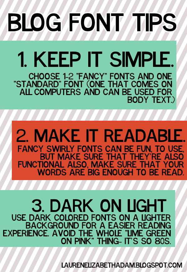
Please, please, please, don't go overboard on fonts. There's just not a reason why you need to use ten different fonts in your design. It just looks tacky. Don't do it. Stick to one or two "fancy" fonts that you might use in your header image, post titles, and sidebar titles and graphics. Then, choose one "standard" font. This should be a font that comes on all computers: Times New Romans, Century Gothic, Arial, Helvetica, Impact, Georgia...one of those kinds of fonts. Use this for the body of your posts. Nothing annoys me more than people that use "fancy" fonts for the body of their posts...it just isn't readable!
So, maybe you're thinking that these three tips sound like good ideas, but you don't really know what constitutes a "good font" vs. a "bad font". Here's just a few examples of both.

Basically, you want to make sure that your fonts are readable. You should aim for your practically blind 87 year old great-great granny to be able to read the font (okay, maybe that's overboard, but you get the idea). If you have more than one "fancy" font, make sure that they go together. Stylistically, they need to be similar. Plus, they also need to go with your theme (what we talked about last time).
By the way, I'm totally serious about the Comic Sans thing (by the way, it would probably be a wise idea to also avoid Papyrus while you're at it, because it's starting to go the way of Comic Sans). It's just not respected in the graphic design world. If you're going for "professional", don't go Comic Sans.
 |
| via |
Whew. Fonts. That was exhausting. Go ahead and pick out the fonts that you are considering for your layout (you can pick a few extras just in case the ones you love don't work out). If you need some ideas to get you started, you can visit my favorite fonts posts (1, 2) or visit the following websites:
Write down the names (and go ahead and download them if you don't already have them!) and we'll pick back up on the series on Monday! Get excited, because we're going to be working on creating a seamless background pattern! :)
i agree with all of this! and i have one more piece of advice to add: don't, for the love of Jesus, use any font that came standard on Picnik. THEY AREN'T CUTE.
ReplyDelete